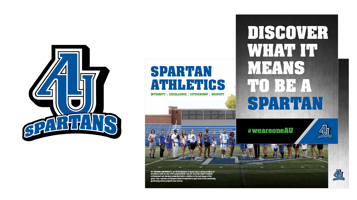
AU Spartans
To revitalize the AU Spartans’ athletic brand, we began by rooting it with a former, historically-significant interlocking AU previously used. We modernized the logo by creating dimension and enhanced identity flexibility through separate secondary marks. Introduction of a new typeface and graphic elements aligned with the grit of Spartan-athletes, expanded the brand system further.
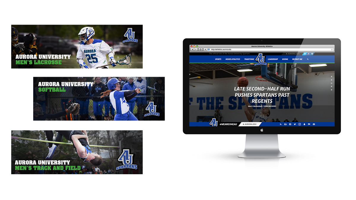
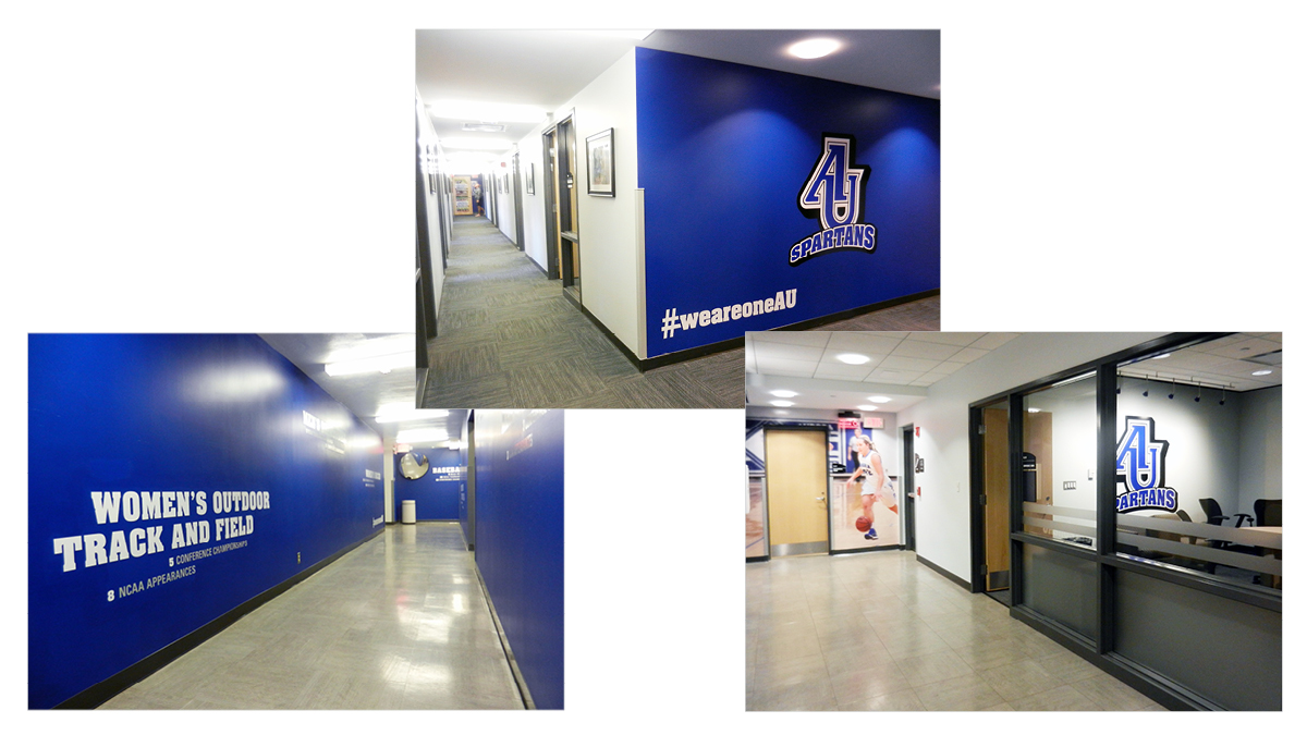
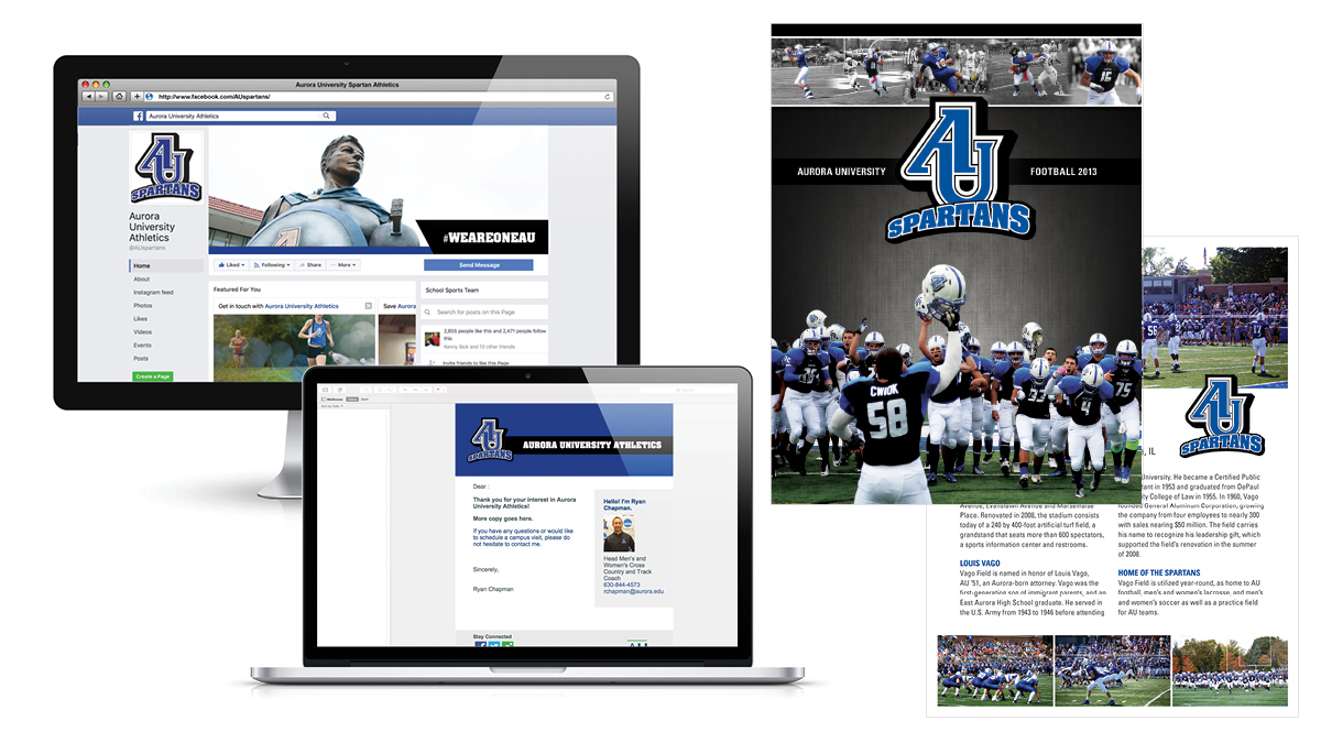
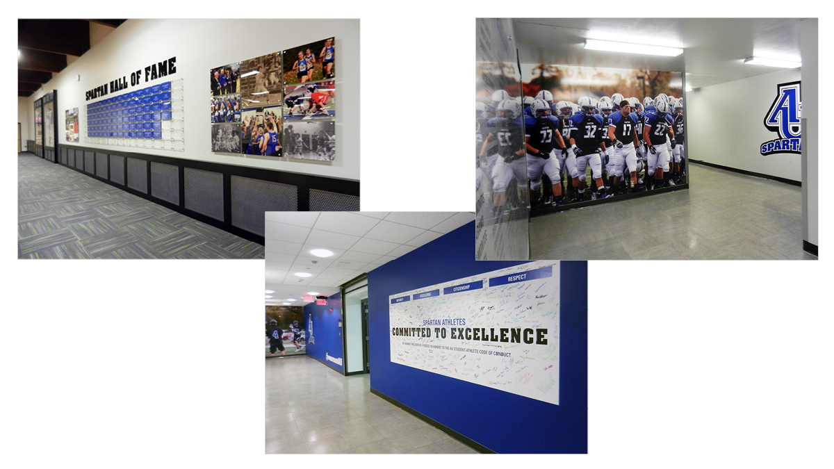
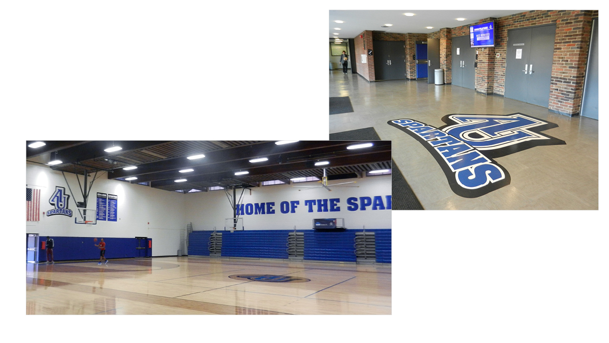
This robust identity outfitted the Aurora University Athletic department with a unified, dynamic brand that the whole team was excited to put into practice. Over several years, we rolled it out across print and digital materials, uniforms, and throughout the physical facilities.